tareco
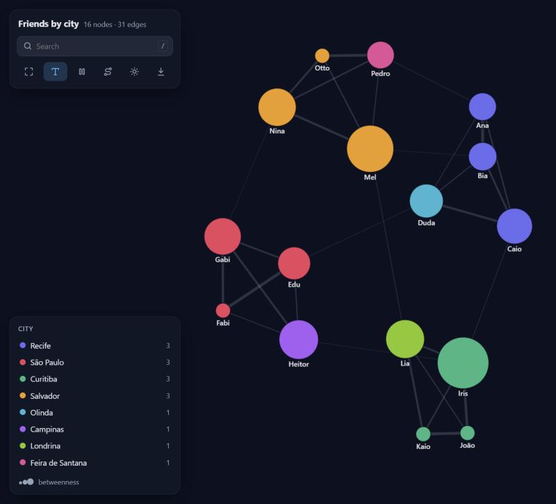
From business data to network answers. Hand it a CSV, a DataFrame or a Spark table and get a beautiful interactive graph you can drag, search and click through, plus what it shows in plain words: which groups exist and what sets each one apart, who bridges them, who concentrates the flow.
No dependencies. Every algorithm is written from scratch in pure Python, and the view is a single self-contained HTML file that works offline.
pip install tareco
Documentation, recipes and live examples: naruminho.github.io/tareco, with the API reference.
New to graphs? There are nine worked recipes, each a real question with its data and a commented script: friends, money transfers, a supply chain, shopping baskets, company e-mail, software dependencies, an outbreak, a subway map and bank statements. Never used graphs at all? Read the beginner's guide.
One line
import tareco

tareco.show("friends.csv")
That's it. Columns named from/to, source/target, origem/destino
(and friends) are found on their own; otherwise the first two columns are used,
with a tareco.GuessWarning saying which. Every other column becomes an edge
attribute. Nodes are colored by community and sized by importance automatically.
- Weight. A column named
weight,amount,value,quantity,total(orpeso,valor,quantidade...) becomes the strength of each edge; failing that, the only number column (messages,minutes; ids, years and dates do not count). Line widths, the summary andweight="weight"in the algorithms use it. Name another one withweight="minutes". - Repeated pairs add up. Ten rows from ana to bia become one edge with the
numbers summed and
count=10, so a raw log of events works as is.
It also takes whatever you already have:
tareco.show([("ana", "bia"), ("bia", "caio", 3.5)])          # pairs, optional weight
tareco.show({"ana": ["bia", "caio"], "bia": ["davi"]})       # dict of neighbors
tareco.show(df)                                              # pandas or polars DataFrame
tareco.show(spark_df)                                        # Spark DataFrame
tareco.show("friends.csv", nodes="people.csv")               # node attributes too
tareco.show("sales.xlsx")                                    # Excel, no pandas needed
tareco.show(df, source="sender", target="receiver", directed=True)
From the terminal:
tareco friends.csv --nodes people.csv --color city
tareco friends.csv --nodes people.csv --explain --lang pt
tareco orders.csv --directed --max-nodes 20000 -o orders.html
tareco messages.csv --time sent_at --lang pt              # replay over time
tareco messages.csv --around ana --hops 2                 # just the neighborhood of ana
tareco friends.csv --nodes people.csv --report -o friends-report.html
tareco transfers.csv --check                              # what in the table would mislead the graph
Investigations work from the terminal too:
tareco statements.csv --account account --counterparty counterparty -o case.tareco
tareco case.tareco --review --limit 10000 --watch a017 -o list.csv   # the work list, as a table
tareco case.tareco --review --since list.csv              # next month: what changed
tareco case.tareco --why a023
What the network shows
g = tareco.Graph("friends.csv", nodes="people.csv")
g.explain()
What this network shows
- 16 nodes and 31 connections; on average each node connects to 3.9 others.
- Everything is connected in a single network.
- It forms 4 groups that mostly connect among themselves: 77% of the connections stay inside a group.
- Group 1 (4 nodes, 25%): city: Recife in 75% (vs 19% overall). Key members: Bia, Caio and Ana.
- Group 2 (4 nodes, 25%): city: São Paulo in 75% (vs 19% overall). Key members: Gabi, Fabi and Edu.
- ...
- The most important nodes are Gabi, Bia and João.
- Iris is a bridge between groups: it links Group 3, Group 2 and Group 1.
- Mel is a bridge between groups: it links Group 4, Group 3 and Group 1.
- The strongest connection is Ana and Bia (42).
explain() reports the facts worth acting on: separate parts and isolated
nodes, groups and what characterizes each one (attributes that are much more
common, or numbers much higher or lower, than in the whole network), the most
important nodes, bridges between groups, hubs, the most telling patterns (below)
and how concentrated the weight is. Each finding also carries the nodes it talks
about (for f in g.explain(): f.text, f.nodes).
tareco.explain("friends.csv", nodes="people.csv") and tareco.report(...) do
the same straight from a file.
In the interactive view the same findings sit behind the insights button: click one to light up its nodes, or to open that group. The legend shows each group's strongest trait.
g.profile()                     # every group in detail: traits, key members, cohesion
g.profile(groups="segment")     # or group by any attribute, dict or list of sets
tareco.set_language("pt")       # explanations and the interface in Portuguese ("es": Spanish)
                                # (by default: TARECO_LANG, then the computer's language)
Patterns
g.patterns()
- a, b and c form a loop: a to b to c to a. Up to 80 can go all the way around.
- relay receives from 6 nodes and passes almost all of it on to 6 (60 in, 60 out).
- sink receives from 6 nodes but sends to none.
- A chain of 3 intermediaries: c to d to e to f to g.
- x and y send each other similar amounts (50 and 48).
- hub is the only connection of 12 nodes.
Shapes worth a second look, in plain words: loops where things go around and
come back (with how much can make the full turn), fan-in and fan-out,
relays that pass on about what they receive, chains of intermediaries,
back-and-forth pairs, stars and cliques. Loops, fans, relays and
chains need a directed graph. g.patterns(kinds=["cycle"], max_cycle=5) narrows
the search; every pattern has kind, nodes, score and text.
Over time
tl = tareco.timeline(messages, time="sent_at")   # one row per event, any table
tl.explain()
tl.show()                                         # with a time slider and a play button
- From 2026-01 to 2026-06 (6 months): 61 nodes and 467 connections in total.
- The busiest period was 2026-05, with 137 connections.
- 30 new nodes showed up in 2026-04.
- star appeared in 2026-05 with 25 connections at once.
- Two groups merged in 2026-05: the one around p58 and the one around p29.
timeline reads dates, datetimes, ISO text, dd/mm/yyyy or mm/dd/yyyy (worked
out from the data) and plain numbers, and picks days, weeks, months, quarters or
years so there are at most 24 periods (freq= to choose). It reports activity
jumps and drops, waves of newcomers, nodes whose connections suddenly jump,
groups that form, merge or split, and quiet periods.
tl["2026-05"]               # the network of one period (a Graph)
tl.union                    # everything, with first/last period on each edge
tl.activity()               # nodes, connections and weight per period
tl.spread("ana")            # who could have heard from ana, following events in order
tareco.timeline(rows, time="day", cumulative=True, weight="amount")
In the view, the slider replays the periods; clicking a dated insight jumps to its period.
Around a node, in huge tables
near = tareco.neighborhood(spark.table("chat.messages"), start="ana", hops=2,
                           source="sender", target="receiver")
near.show(color="hop")
When a table is far too big to load, start from the nodes you care about and
grow outward. With Spark every hop is a query that runs in the cluster (a
broadcast join when the frontier is large); only the matching edges come back.
It also works on pandas DataFrames, CSV files and rows. max_nodes (5,000) caps
the growth, keeping the most connected nodes of the last hop.
Reports and tables
g.report("friends-report.html")               # findings, group and node tables, the graph
tl.report("messages-report.html")             # plus activity per period and the slider
nodes, edges = g.to_pandas(metrics=["pagerank", "community", "degree"])
nodes, edges = g.to_spark(spark, metrics=["community"])   # back to the lakehouse
g.explain().to_pandas(), g.profile().to_pandas(), g.patterns().to_pandas()
The report is one self-contained HTML file to send to someone who will never open a notebook.
Two-sided data
Business data often says "customer bought product" or "account used device", not
"who is linked to whom". project links the things you care about through what
they share:
purchases = spark.table("sales.items")          # customer, product, amount, segment
g = tareco.project(purchases, nodes="customer", via="product")
g.explain()                                     # customer groups and what they buy alike

items = tareco.project(purchases, nodes="product", via="customer")
items.top_neighbors("diapers", n=3)             # bought together, most shared customers first
Edges get weight (shared products), shared and a few examples. Columns that
never change for a customer (like segment) become customer attributes, and
changing numbers are summed (amount_total), so groups can be profiled right away.
method="jaccard"scores pairs by overlap (0 to 1);method="newman"lets popular products count less, so "both bought water" means little.- Products bought by more than
max_item_sizecustomers (1,000) are skipped with a warning: they link everyone to everyone and cost millions of edges. attrs=customers_dfbrings a table of customer attributes along.g.project(nodes)does the same for a graph that already holds both sides.
Several kinds of links
Real models mix things: accounts, devices, addresses; transfers, logins, ownership. Each table joins the graph as links of its own kind:
g = tareco.Graph(transfers, kind="transfer", directed=True)
g.add_links(logins, source="account", target="device", kind="uses")
g.kinds()                            # {'links': {'transfer': 7303, 'uses': 342}, 'nodes': {...}}
g.only("transfer")                   # just the money
g.project("account", via="device")   # accounts linked by the devices they share
- Node kinds come from the column names (
account,device), or fromsource_kind=/target_kind=.g.show(color="kind")colors by them. - Links between two different kinds of node (an account and its device) have no direction unless you say so; flow analyses (loops, fan-ins, chains, amounts) only follow the directed kinds.
- Ids that clash across kinds get a prefix (
device:123) and a warning. - In the view, each kind of link has its own color, and the legend hides or shows each one.
Money, statements and investigations
g = tareco.Graph(statements, account="account", counterparty="counterparty",
                 kind="transfer", keep=True)
g.splits(limit=10_000, within="7 days")   # many amounts just under a limit
g.unusual_amounts()                       # far above what the account usually sends
g.flows(by="counterparty_country")        # where the money goes
g.misfits("monthly_income")               # unlike the accounts it deals with
g.near(["a017"])                          # close to a list you give
g.fast_moves(within="3 days")             # a large amount in, most of it out again within days
g.trace("a181", "PI-ACC-8")               # paths that follow the transfers in time order
g.why("a023")                             # one account, in plain words
g.similar_to("a017")                      # others that behave like a known case
g.review(watch=["a017"])                  # all of it per account, ranked: a work list
g.entities(via="device")                  # accounts tied by what they share: one person?
- a017 sent 8 transfers just under 10,000 within 5 days (2026-04-13 to 2026-04-18), to 4 receivers, 9,434 to 9,901 each.
- a055 sent 85,000 to ART-DEALER-W on 2026-03-14, 819x what it usually sends (104).
- a023 has monthly_income 2,060, 67x lower than the median of the 5 nodes it deals with (137,780).
- a142 is 2 steps from a017, through dev-77 (device).
Most like a017
- a142 (0.26): sends to nodes that hear from nobody else; piles amounts just under a round limit; ...
account=andcounterparty=read a bank statement: one row per entry, money out negative. A transfer between two customers shows on both statements and is counted once.- Behaviors are named in plain network terms; the limits, time windows and lists to watch come from you. A pile under a limit only counts when the amounts gather just under it (a payroll paying every size of salary is not a pile); closeness never goes through hubs (everybody is two steps from a supermarket).
- With rows kept,
explain()adds the strongest of these on its own.
A work list. g.review() gathers every signal per node and ranks them, one
line per kind of signal and the ids of the rows behind them:
Worth a look
1. a023 (score 11.2), 6 rows behind it
   - a023 received 40,493 and passed on 41,746 within 3 days (2026-03-20 to 2026-03-23).
   - a023 receives from 6 nodes and passes almost all of it on to 32 (207,767 in, 173,508 out).
   - a023 has monthly_income 2,060, 67x lower than the median of the 5 nodes it deals with (137,780).
   ...
review.to_pandas() and review.to_spark(spark) make it a table to save next to
the data. Next month, g.review().compare(last_month) says what changed: who is
new in the list, whose score went up (with the reasons that are new), whose went
down and who left it. last_month can be the earlier review or the table it was
saved as. g.entities(via="device").graph() merges accounts tied by shared
devices (or phones, addresses) into one node each, so every question runs per
person; identifiers shared by too many accounts tie nobody.
Back to your records. keep=True (or keep=["transaction_id", ...]) keeps
the rows behind every link:
g.rows("a017")                                   # every row about an account
g.splits(limit=10_000)[0].rows.to_pandas()       # the rows behind one finding
tareco.records(spark.table("statements"), g.similar_to("a017").nodes, columns=["account"])
tareco.records looks up any list of ids in the original table and returns it
in the table's own format; on Spark the filter runs in the cluster.
How sensitive. Every tool takes its thresholds as arguments; tareco.settings
changes the defaults they all fall back on, the work list's weights included:
tareco.settings(split_limit=10_000, unusual_factor=20)   # from now on
with tareco.settings(fast_within="24 hours", weights={"near": 3}):
    g.review()                                           # only inside the block
print(tareco.settings())                                 # every setting, the changed ones marked
The names follow the tools: split_limit, split_within, split_count,
split_margin; unusual_factor, unusual_history, unusual_top; fast_within,
fast_share, fast_top; misfit_factor, misfit_neighbors; fan_min,
cycle_max, near_hops, shared_max; weights, repeat, repeat_cap.
help(tareco.settings) says what each one does; reset=True puts them all back.
Pick it up later. g.save("case.tareco") writes the whole graph to one file:
nodes, links, the rows kept behind them, the kinds of link and node, and the id
prefixes. tareco.load("case.tareco") (or tareco.Graph("case.tareco")) gives it
back as it was, dates still dates, so the next session starts where this one
stopped. The file is gzip-compressed JSON.
The view
- Hover a node to light up its neighborhood; click it for a side panel with what stands out about it, its metrics, attributes and clickable neighbors.
- Insights: the findings in words; clicking one lights up its nodes and, when rows are kept, shows the rows of your table behind it.
- Drag nodes around; dragged nodes stay pinned (right-click to release).
- Search with
/, jump with Enter. - Shortest path mode: click two nodes and the route lights up.
- Legend filters: click a group to hide it, double-click to see only it.
- Freeze the layout, toggle labels, switch dark/light, save a PNG.
- Directed graphs get arrows;
particles=Trueanimates the flow. dim=3gives you a 3D graph you can orbit.
g.show(
    color="city",            # attribute or metric: "community", "pagerank", "degree",
                             # "betweenness", "closeness", "clustering", "core", "component"
    size="betweenness",      # same options, numbers only
    label="name",            # attribute to display instead of the id
    edge_width="messages",   # defaults to "weight" when edges have one
    title="Friends",
    theme="dark",            # "auto", "dark", "light"
)
g.save("friends.html")       # standalone file, send it to anyone
g.save("friends.svg")        # a still picture for slides and e-mails (.png with Pillow)
color and size also accept a {node: value} dict (like the output of any
algorithm), a function of the node, or a fixed CSS color.
Notebooks and Databricks
In Jupyter, VS Code, Colab and Databricks, g.show() draws the graph right in
the cell, and so does leaving a graph as the last line of a cell. On Databricks
it goes through displayHTML. Where there is neither a notebook nor a browser
(a cluster job, a server), the page is saved to a temporary file and its path is
printed.
Notebook output is kept under a size budget, because big outputs get cut:
Databricks truncates cell output at 10 MB by default (DBR 17+). If a graph does
not fit, tareco keeps its most important part and says so in the header
(48,000 of 1,200,000 nodes). Pass budget_mb= to change it; on Databricks,
%set_cell_max_output_size_in_mb 20 raises the limit.
Checking an environment
tareco.doctor(spark) # or tareco.doctor() without Spark; `tareco --doctor` in a terminal
OK    environment                 tareco 1.3.0, Python 3.12.3, Databricks 17.3, notebook output budget 9 MB
OK    webgl page                  20,000 nodes, 2.0 MB, ASCII only
OK    notebook output             60,000-node graph fits in 5.1 MB (budget 9 MB)
OK    spark: flavor               Spark Connect, Spark 4.0.1
OK    spark: neighborhood (join)  57 nodes within 2 hops of 'hub'
...
tareco doctor: all good
It runs every path that can break in a new place (notebook detection, output size, the WebGL and canvas pages, timelines, reports and, given a session, reading from Spark, neighborhoods, exports and timelines there, classic Spark or Spark Connect) and reports each one. For Databricks there is a ready notebook, examples/databricks_check.py: import it, run all, and every cell after the doctor should draw a graph.
Spark
from pyspark.sql import functions as F

messages = spark.table("chat.messages")        # sender, receiver, sent_at, ...

edges = (messages
         .groupBy("sender", "receiver")
         .agg(F.count("*").alias("weight")))

g = tareco.Graph(edges, source="sender", target="receiver", directed=True)
g.show(title="Who talks to whom")
A Spark DataFrame is streamed to the driver one partition at a time (no pandas
needed), and DECIMAL columns become floats. Anything above max_rows rows
(1,000,000 by default) is refused with a hint to aggregate in Spark first, which
is almost always the right move: a graph of who-pays-whom with a total per pair
is far smaller than the raw transactions. max_rows=None lifts the limit.
Inside the cluster. For edge tables too big to bring over, tareco.big
answers in Spark and returns Spark DataFrames (no GraphFrames; it runs on Spark
Connect and Databricks serverless too):
edges = tareco.big.statement_edges(spark.table("statements"), "account", "counterparty", "amount")
tareco.big.components(edges)        # node, component (1 = the biggest)
tareco.big.degrees(edges, weight="amount")
tareco.big.pagerank(edges)
tareco.big.communities(edges)       # label propagation
tareco.neighborhood(edges, start="a017", hops=2)   # a small piece, as a Graph
Big graphs
Tens of thousands of nodes are fine. The view changes strategy as the graph grows:
- Up to 2,000 nodes / 8,000 edges: the canvas view above, animated.
- Bigger: a WebGL view (sigma.js). The layout runs in a background worker, so the page never freezes while it settles, and edges fade with density so structure shows instead of a white blob. Nodes are pulled toward their community, so groups read as islands.
- Group overview: every community (or every value of a categorical
color) becomes one bubble, sized by members and linked by how much they interact. Click a bubble to open just that group; very big graphs open here first. - Trimming: past
max_nodes(50,000) ormax_edges(200,000), only the most important nodes (by PageRank) and the heaviest edges are embedded. The overview still counts everything. - Findings: the insights, the notes on each node and the work list look at
the whole graph, sharing what they work out: 300,000 transfers take a few
seconds. Past 1,000,000 links the view leaves them out unless you pass
insights=True(orinsights=g.explain()).
g.show(renderer="webgl")              # force a renderer: "auto", "canvas", "webgl"
g.show(max_nodes=20_000)              # embed less (smaller, faster page)
g.betweenness(k=500)                  # estimate from 500 sources instead of all nodes
Exact betweenness needs a search from every node. With the optional igraph
package installed (pip install igraph), it runs there for graphs above 1,000
nodes, about 15 times faster; tareco itself stays dependency-free.
Community detection handles 50,000 nodes and 200,000 edges in about two seconds, in pure Python.
The graph
g = tareco.Graph("friends.csv", nodes="people.csv")

g.add_edge("Ana", "Zeca", weight=2, since=2019)
g.add_node("Zeca", city="Recife")

g.nodes["Ana"]              # {'city': 'Recife', 'age': 31}
g.edges["Ana", "Bia"]       # {'messages': 42}
g.neighbors("Ana")          # ['Bia', 'Caio', 'Duda', 'Pedro', 'Zeca']
g.degree("Ana")             # 5
len(g), g.edge_count        # (17, 32)

g.subgraph(["Ana", "Bia", "Caio"])
g.ego("Ana", radius=2)       # everyone within two steps
g.reverse(), g.to_undirected(), g.copy()
The questions
| Ask | Method |
|---|---|
| What it shows, in words | g.explain(), g.profile() |
| Overview numbers | g.summary() |
| Shortest route | g.shortest_path(a, b, weight=None), g.distance(a, b), g.distances(a) |
| Who is important | g.pagerank(), g.degree_centrality() |
| Who bridges groups | g.betweenness(k=None) (k sources estimate it fast) |
| Who is close to everyone | g.closeness() |
| Which groups exist | g.communities() (Louvain), g.modularity(groups) |
| Are they connected | g.components(), g.strong_components(), g.is_connected() |
| How tight is it | g.clustering(), g.triangles(), g.transitivity(), g.density() |
| The core | g.core_number(), g.k_core(k) |
| Who should meet | g.suggest_links(node=None, top=10) (Adamic-Adar) |
| Strongest ties of a node | g.top_neighbors(node, n=5) |
| Cheapest wiring | g.spanning_tree(weight="weight") |
| How much can flow, and the bottleneck | g.max_flow(a, b, capacity="weight") (.value, .flows, .cut) |
| Alternative routes | g.k_shortest_paths(a, b, k=3, weight=None) |
| Shapes worth a look | g.patterns() |
| Amounts just under a limit | g.splits(limit=None, within="7 days") |
| Amounts far above the usual | g.unusual_amounts(factor=10) |
| Unlike the nodes it deals with | g.misfits(attrs=None, factor=10) |
| Close to a list | g.near(targets, hops=2) |
| Where the flow goes | g.flows(by) |
| One node, in words | g.why(node, watch=None) |
| Behaves like a known case | g.similar_to(nodes, n=10) |
| The rows behind it | g.rows(nodes), tareco.records(table, nodes) |
| Money passed on fast | g.fast_moves(within="3 days") |
| Paths in time order | g.trace(source, target=None, within="30 days") |
| A ranked work list | g.review(watch=None) |
| One person, several accounts | g.entities(via=None) |
| What changed | tareco.compare(before, after), timeline.compare(p1, p2) |
| A still picture | g.save("graph.svg"), g.save("graph.png") |
| Order of tasks | g.topological_sort(), g.has_cycle(), g.find_cycle() (one loop, any length) |
| Size of the world | g.diameter() |
| Walk it | g.bfs(a), g.dfs(a) |
Results are plain dicts, lists and sets. Pass weight="some_attribute" to use
edge weights. The algorithms are tested against networkx and give the same
numbers.
Ready-made graphs
tareco.community_graph([30, 20, 10])   # planted groups, great for testing communities()
tareco.scale_free_graph(500, 2)        # a few big hubs, like the web
tareco.small_world_graph(100, 4, 0.1)  # ring with shortcuts
tareco.random_graph(100, 0.05)
tareco.grid_graph(10, 10), tareco.complete_graph(8), tareco.star_graph(6)
tareco.path_graph(5), tareco.cycle_graph(5)
In and out
g.to_csv("edges.csv", "nodes.csv")    tareco.read_csv("edges.csv", "nodes.csv")
g.to_json("graph.json")               tareco.read_json("graph.json")
g.save("case.tareco")                 tareco.load("case.tareco")
                                      tareco.read_excel("book.xlsx", sheet="sales")
nodes_df, edges_df = g.to_pandas()    tareco.Graph(df, nodes=nodes_df)
g.to_networkx()                       tareco.Graph(nx_graph)
CSV files may use , ; \t or |, and 1,5-style decimals are understood.
.xlsx files are read without pandas or Excel: dates become dates, numbers numbers.
Development
pip install -e ".[test]"
pytest
The interactive views are drawn with force-graph, sigma.js and graphology (all MIT), bundled inside the package so pages work offline. The 3D view loads 3d-force-graph from a CDN.